
HRM Fiscal Power Rankings methodology

In Issue 30 of Grand Parade we published a list of fiscal power rankings which added up all of the tax revenue a district generates and then subtracted all of the expenses. The city does not organize it’s data in a way that makes this easy to do, so this article is to explain how we came up with the power rankings.
First comes the raw data compiling and analysis and this was done by Kevin Wilson a local researcher who runs the YouTube channel HFX by Bike. One thing to note right off the top is that districts, although a useful political tool, are not a great tool for fiscal analysis. Wilson is becoming more granular in his modelling, and you can follow the iterations of his research on Bluesky.
But here is how Wilson is coming up with his numbers (and some analysis of his at the end):
To estimate the balance of revenues and costs for different parts of HRM, we need estimates of both. Revenues are pretty easy: property tax data is made available by the city a couple of years after the fact. This can be linked by assessment number to Property Valuation Service’s (the people who assess properties for the city/province for tax purposes) datasets that have information on things like lot sizes and number of dwelling units.
Costs are a lot trickier: Halifax, like most cities, doesn’t track costs to provide services; it just reports how much it spends on a given service in any given year, region-wide. However, in 2004/2005, the city had a report (or a couple of reports, actually) that tried to estimate the cost to provide different services to different levels of residential density. These are defined by the amount of space per dwelling unit in a given area.
So, with the data from PVS on how large each lot is and how many residential units properties on it have, I can assign a given geographic area to one of the density bins in the report, and estimate the costs to provide services within that boundary.
Boundaries in the current iteration of the analysis are based on the province’s Transportation Analysis Zones – neighbourhood-sized slices of the region used for transportation planning purposes. Each zone is assigned to a density bin, and costs to service each property are calculated based on that classification. Earlier versions were based on pre-amalgamation voting districts, but those are much larger and less precise.
The original 2004/2005 reports were all about accurately assigning costs to residential properties, and so there’s no mechanism for estimating the cost to service different types of commercial properties. In the current iteration, I take the average cost per acre of the district a commercial property is in, and assign it to commercial properties in that district. So, office towers downtown get assigned the same service costs as the apartment buildings near them, and Burnside absorbs the cost structure of the low-density suburbs to the east (etc). All cost estimates are adjusted for inflation between the original report and the year of the tax data (2023/2024 fiscal).
From there, summary values of revenues and cost estimates can be calculated at the level of modern polling districts or whatever other boundaries are interesting to people. I should note that the resulting numbers are just estimates based on average service costs estimated by the city; they are not a line-level accounting based on actual on-the-ground services and infrastructure spending being measured in real-time. Different parts of the city could be paying the same transit rates but receive radically different levels of service (e.g Eastern Passage’s regular, moderate frequency service vs Tantallon’s express buses), and these averages aren’t going to capture that level of specificity.
But that’s part of the point of the analysis; different parts of the city generate radically different levels of revenue and have completely different costs to provide similar services, and the city seems broadly unaware of this concept.
I’m constantly updating the cost model based on feedback from people, for instance by removing road costs for extremely rural zones (this will eventually be updated to be more precise and align with the municipal-provincial service boundary), but the basic cost estimate is always going to be based on the averages from the city’s report, because that’s all there it to go on.
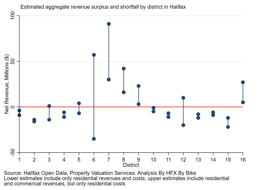
What does it mean for the city? The exact rankings shift a little bit depending on how you model it, and especially whether you include commercial properties or limit to residential, but you mostly end up with the districts on the Peninsula (7, 8, and 9) generating significant surpluses even just on the residential properties, but especially once you include commercial (hell, Downtown and streetcar suburb commercial streets).
Bedford also sits at this table (pretty similar to North End Halifax in scale), but as far as I can tell this is new. As recently as the early 2000s, the model suggests it would have been losing money.
Then there’s a tier of what are essentially the city’ inner and middle distance suburbs. The basically all lose money even with commercial, although adding commercial gets some of them vaguely close to break-even. District 6 is hard to model because, by volume, it’s basically just an industrial park and its costs very much depend on how much you think it costs to service commercial properties.
The worst off as far as I can tell are districts 2 and 15. Both are fairly low density and have minimal commercial footprints, and so end up with really unfavourable revenues vs cost profiles.
With that, modelling Wilson produced the net cost/revenue dataset shown below. The lower dots are residential tax revenue minus costs and the upper dots are all tax revenue minus costs.
Then we here at Grand Parade took that data and ran at it with new assumptions. For example, do those 2004/05 reports line up with information in other documents? Did Halifax attempt to reform its tax structure in light of the 2004 report? It did, with the Tax Reform Committee, as explained in this 2008 report. Were the models’ assumptions consistent with other later analyses? In this 2013 Alternative Growth Scenarios report (which eventually resulted in the centre plan), we can see that the model’s assumptions are broadly in line with the reality of the early 2010s. And in a literature review of a slew of different reports about the cost vs revenue discrepancy of suburbs, the assumptions underpinning the 2004/05 report exist to some degree wherever suburbs are built.
And if Wilson’s model is accurate, in 2023/24 the city should have had about $188 million that didn’t go directly to operational expenses. And if you look at the 23/24 budget books you can see that the city spent $188 million on debt servicing costs, capital from operating, and strategic reserve funding in 23/24.
This is not the perfect fit the matching $188 million may imply, however, in conjunction with the other contextual reports, it does lead us to believe that Wilson’s modelling, even though not perfect, is accurate.
Or at the very least, accurate enough for a Fiscal Power Rankings that you can use to contextualize the comments of suburban councillors who claim to be fiscally responsible while advocating for downtown spending cuts and lower taxes for their underpaying residents.